Health systems rely on health data so policy makers can understand what health issues people are facing in a given country, what health programs are working, what resources are available, and what changes should be made to optimize health.
The systems that produce this data are health information systems (HIS). They are as complex as the overall health systems they support; and they comprise data collected from the smallest health clinic to the national health ministry. Because HIS are complex, many issues of data quality and thoroughness often arise. Moreover, data cover a myriad of topics: how many babies are born in a district, how many people get sick from malaria, how many stocks of medicines are available right now. And, to further complicate matters, data move back and forth: from a health facility to a district office and back to the facility; from the district level to a national database.
Further, to be of any use in improving health, data collection is not enough. Someone must check their quality; someone must aggregate data from many sources; someone must analyze what the data are saying. Then, someone must put this learning to good use.
The operation and interaction that occur daily within an HIS is sometimes easier to grasp in visual terms. This collection of graphics tells part of the story of how an HIS performs and what it can contribute to health improvements.
A Stronger Health Information System Means a Healthier Country
 |
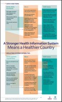
This poster illustrates how the quality and availability of health data can improve health outcomes. The illustration depicts a health system with only limited data function and what kinds of capabilities that health system would possess. It then shows what additional functions might be possible for a health system that had additional data at hand; and, finally, what kinds of health questions and trends could be identified with still more available and robust data.
|
|---|
Map of Data Flow in Health Information Systems (a series):
 |
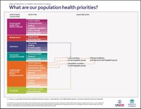
What are our population health priorities? This flow chart shows that data collection from laboratories, health facilities, and households helps decision makers understand how health programs, disease incidence, and trends in disease prevalence variously affect population groups. |
|---|
 |
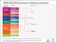
What resources do we have to address our priorities? This flow chart maps how data collected at various sites informs decisions that sustain a health system and improve the outcomes it can deliver. Examples include national and district health data that inform funding and staff; health facility data that provide information on staff, funding, and supply chains; and laboratory data regarding durable goods and medical supply chains. |
 |
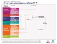
Are we using our resources efficiently? This flow chart shows the pathways of data from government offices that illuminate funding and help identify additional resources needed. Other pathways—such as community data—inform costs and service coverage. Health facility data map services and costs per service and household data reveal service coverage and unmet need. |
 |
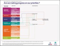
Are we making progress on our priorities? This flow chart illuminates how all data collection sites help track major indicators of HIS function: monitoring disease trends, program reach and effectiveness, and compliance with national goals. |

